7balanced
In a space crowded with claims and performative health language, we identified a clear gap one defined by excess visual noise competing for attention. 7Balanced was shaped around the philosophy of a Zen garden, a space designed not to add, but to remove. To create calm through intention. To find balance through restraint. The Zen garden concept became a guiding framework for the brand’s creation. Rather than adding another layer, our approach was to remove. We treated every decision as an act of curation, questioning what was essential, what was unnecessary, and what genuinely contributed to nourishment.
The Zen garden concept informed the brand at every level. Language was pared back, visuals were given room to breathe, and hierarchy was used to create a sense of quiet confidence rather than urgency. This philosophy allowed us to position 7Balanced as a brand that feels grounded and credible, not aspirational or performative. 7Balanced stands as an example of how subtraction can become strategy and how clarity can be a competitive advantage.
Client
7BALANCED
DELIVERABLES
BRAND STRATEGY
BRAND POSITIONING
Brand identity
TONE OF VOICE
BRAND LOGO
PACKAGING
BRAND COLLATERALS
BRAND GUIDELINES
Year
2025
INDUSTRY
FOOD
7balanced
In a space crowded with claims and performative health language, we identified a clear gap one defined by excess visual noise competing for attention. 7Balanced was shaped around the philosophy of a Zen garden, a space designed not to add, but to remove. To create calm through intention. To find balance through restraint. The Zen garden concept became a guiding framework for the brand’s creation. Rather than adding another layer, our approach was to remove. We treated every decision as an act of curation, questioning what was essential, what was unnecessary, and what genuinely contributed to nourishment.
The Zen garden concept informed the brand at every level. Language was pared back, visuals were given room to breathe, and hierarchy was used to create a sense of quiet confidence rather than urgency. This philosophy allowed us to position 7Balanced as a brand that feels grounded and credible, not aspirational or performative. 7Balanced stands as an example of how subtraction can become strategy and how clarity can be a competitive advantage.
Client
7BALANCED
DELIVERABLES
BRAND STRATEGY
BRAND POSITIONING
TONE OF VOICE
BRAND LOGO
PACKAGING
BRAND COLLATERALS
BRAND GUIDELINES
Year
2025
INDUSTRY
FOOD


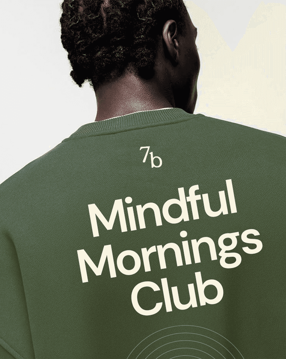
BRAND LANGUAGE
The visual language draws from the raked lines of a Zen garden which are repetitive, deliberate marks that create order through rhythm and restraint. We translated this philosophy into graphic form by working with concentric paths, measured spacing, and uninterrupted flow. The result is a set of symbols that express equilibrium, wholeness, and movement, just as a Zen garden finds meaning in what is removed, this system relies on clarity, repetition, and intention to communicate balance.
Each category is expressed through a distinct pattern, derived from the same underlying structure. The forms shift to reflect balance, wholeness, or movement, while remaining visually connected allowing variation without fragmentation.


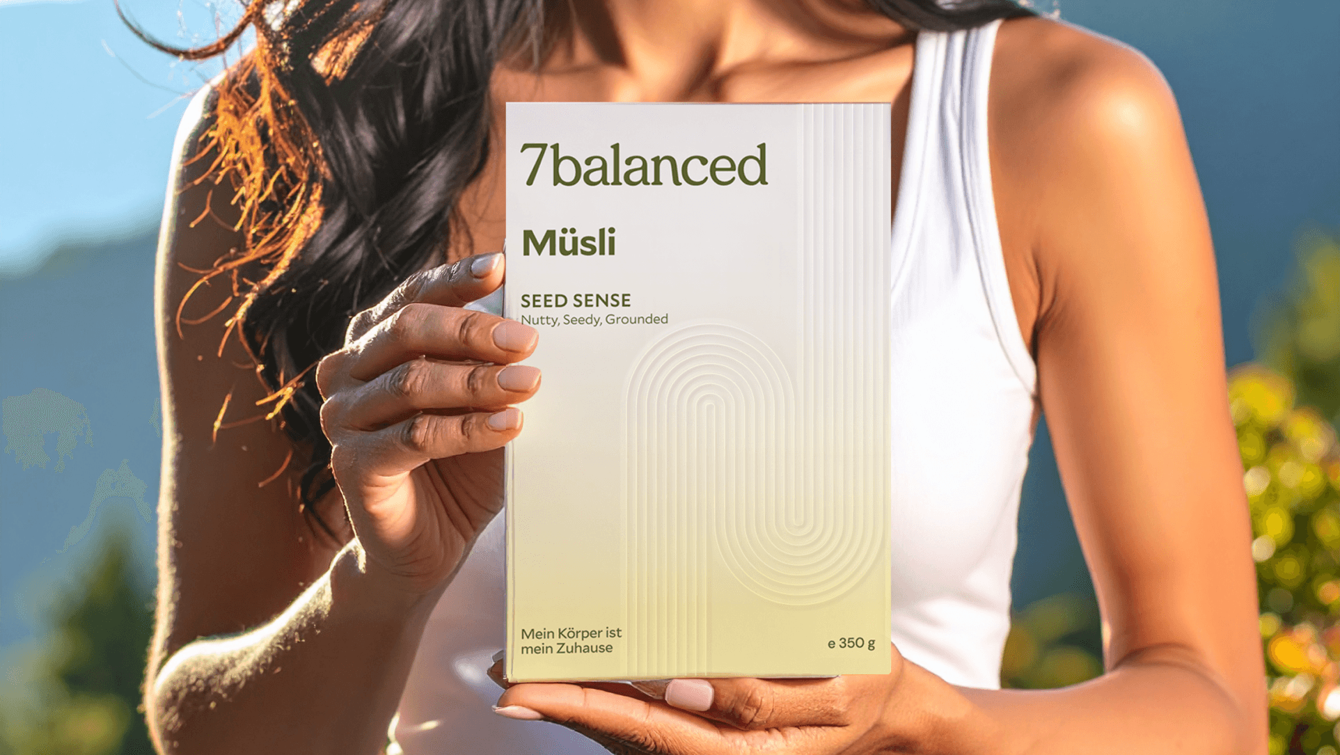
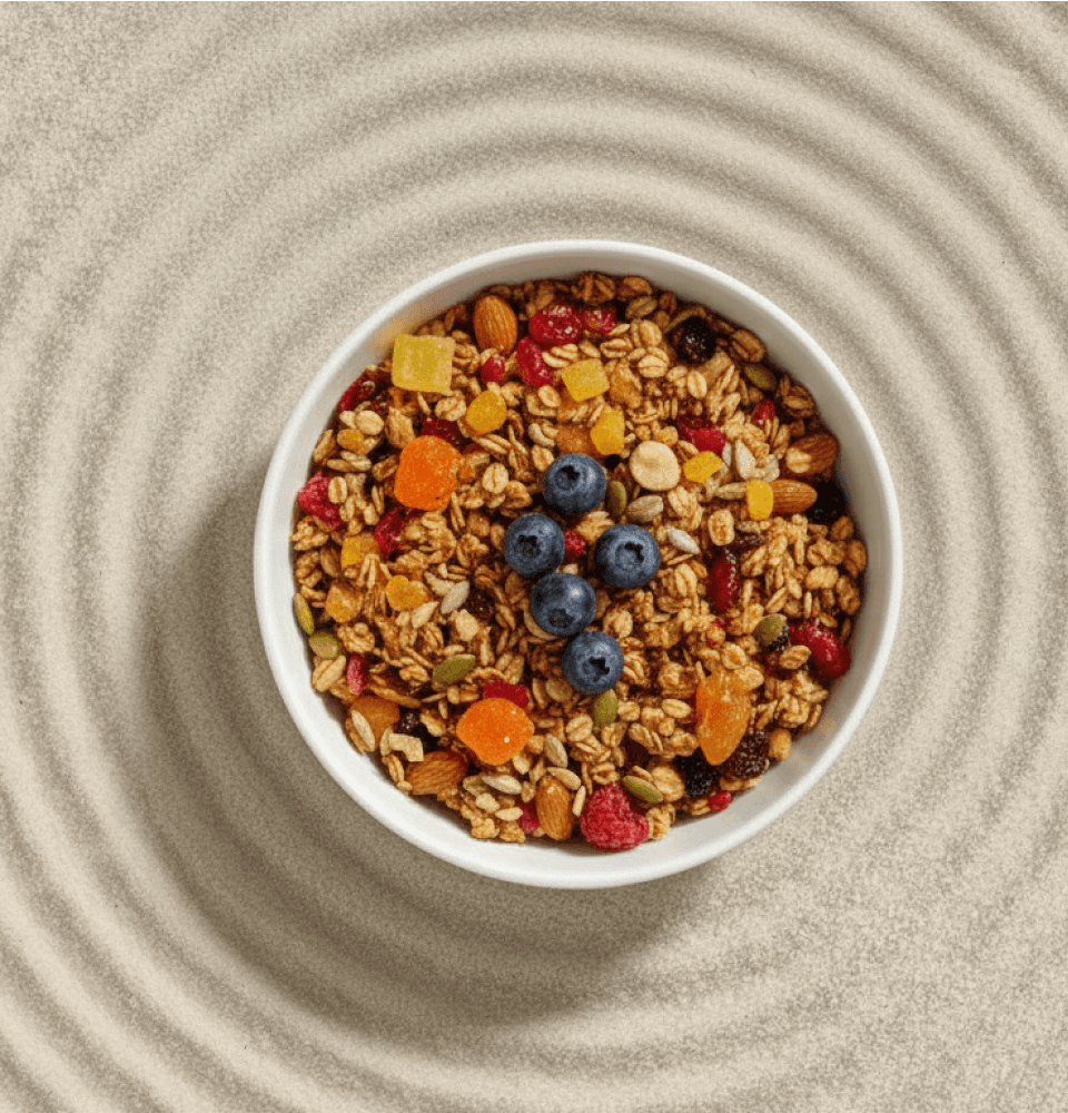
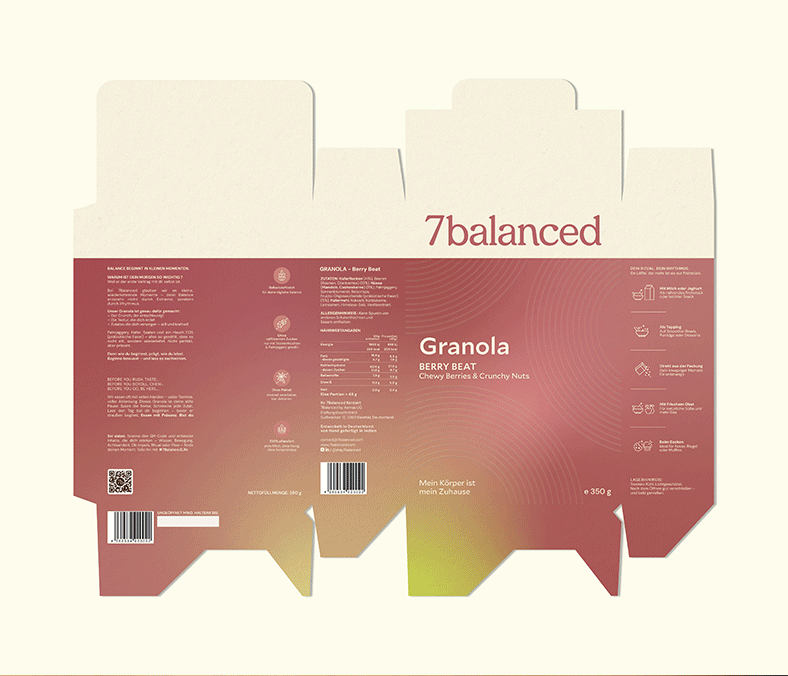
PACKAGING
The packaging for 7Balanced was designed as a continuation of the brand’s core philosophy to create something meaningful and considered in a crowded food category. Rather than relying on familiar health or wellness cues, we extended the Zen garden concept into the packaging through a system of linear patterns inspired by raked lines. These lines bring a sense of calm, order, and rhythm, reinforcing the idea of balance through restraint and intentional design.
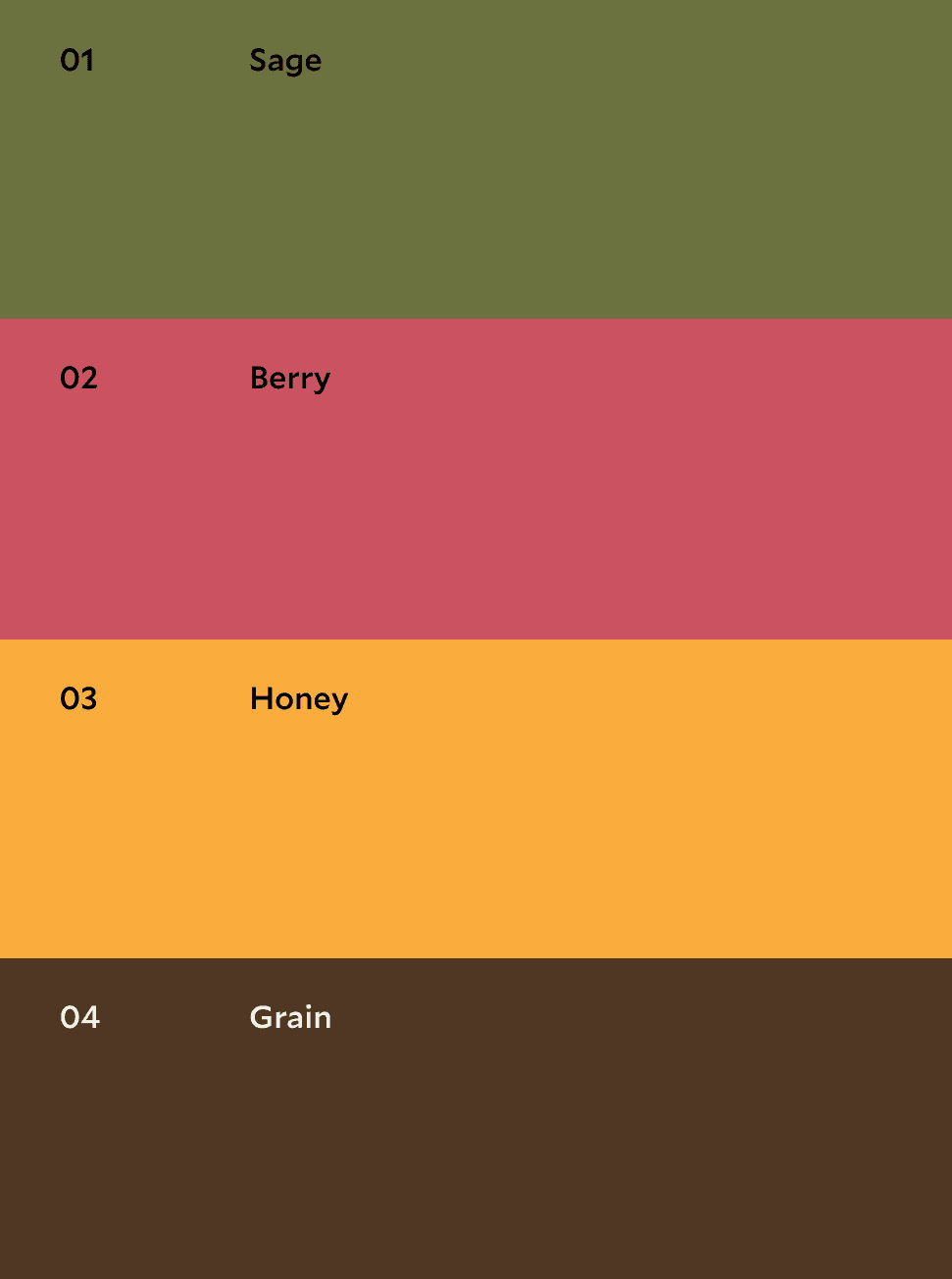
Colour was treated as a key storytelling element. Each flavour is represented through a carefully curated palette that captures its essence without exaggeration. This allows differentiation across variants while maintaining a cohesive visual language.
PACKAGING
The packaging for 7Balanced was designed as a continuation of the brand’s core philosophy to create something meaningful and considered in a crowded food category. Rather than relying on familiar health or wellness cues, we extended the Zen garden concept into the packaging through a system of linear patterns inspired by raked lines. These lines bring a sense of calm, order, and rhythm, reinforcing the idea of balance through restraint and intentional design.
Colour was treated as a key storytelling element. Each flavour is represented through a carefully curated palette that captures its essence without exaggeration. This allows differentiation across variants while maintaining a cohesive visual language.


*Imagery used is strictly for illustrative purposes only and has been sourced from publicly
available references.
*Imagery used is strictly for illustrative purposes only and has been sourced from publicly available references.
*Imagery used is strictly for illustrative purposes only and has been sourced from publicly available references.